
 Send to Kindle
I think it is important that kids understand what is going on so they have the power to ask questions and process their own fears and concerns. And when I was thinking about this, I realized that I am not sure how many adults fully get why this is scary. I often see people continuing to go out to see people because they are bored, and it made me realize that it is possible that the severity of COVID-19 has not really been made clear. So I thought I would explain this, the way I would explain it to my kids. But please keep in mind, I find this information more scary than the horror movies from my childhood.
We can use basic math to understand the growth. But let’s talk about video games. Anyone ever played Piggy on Roblox?
The premise of this game is kind of like tag. If you are “it” you tag another player and make them “it”.
There are two modes I like to play on:
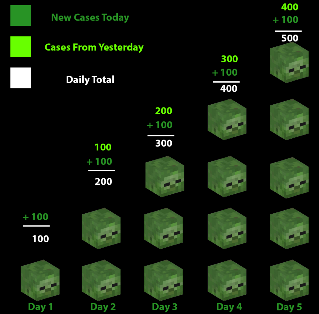
Bot/Player: With this mode, it means that there is a single person who is “it”, and they tag as many players as they can.
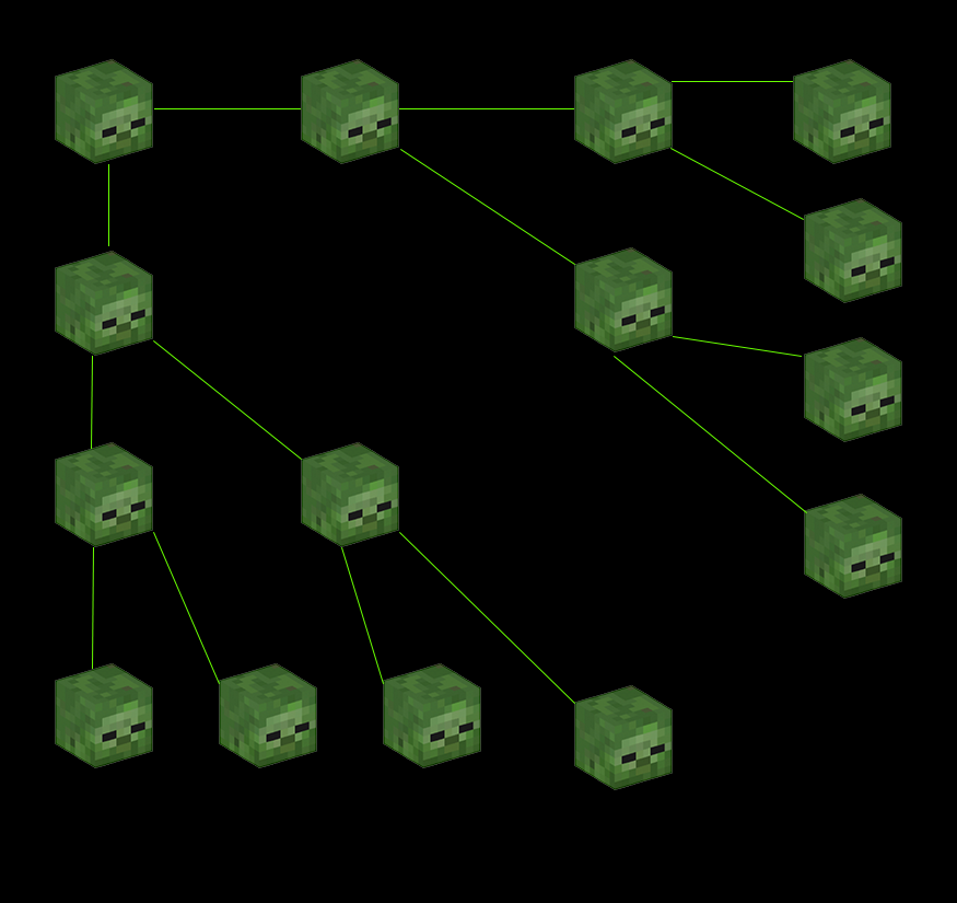
Infection: With this mode, it means that you start with a single person who is “it”. And after that, every person tagged also becomes “it”. The original “it” remains “it” too.
When we talk about Coronavirus, it is important realize that MOST people think about the outbreak as if this is on Bot/Player mode.
I created my graphs using Minecraft heads because they are easier to work with. 😉
So imagine that you have:


Steve and Alex represent People who are not sick. Zombie represents people that are sick. If we were playing Bot/Player, this is what it would look like. Every day, the person who is it, could tag 100 people (Each Zombie is 100 people). If we had 500 players, by Day 5, we would have everyone tagged.
But Coronavirus, is much more like infection. So, game play is much more like this visual:
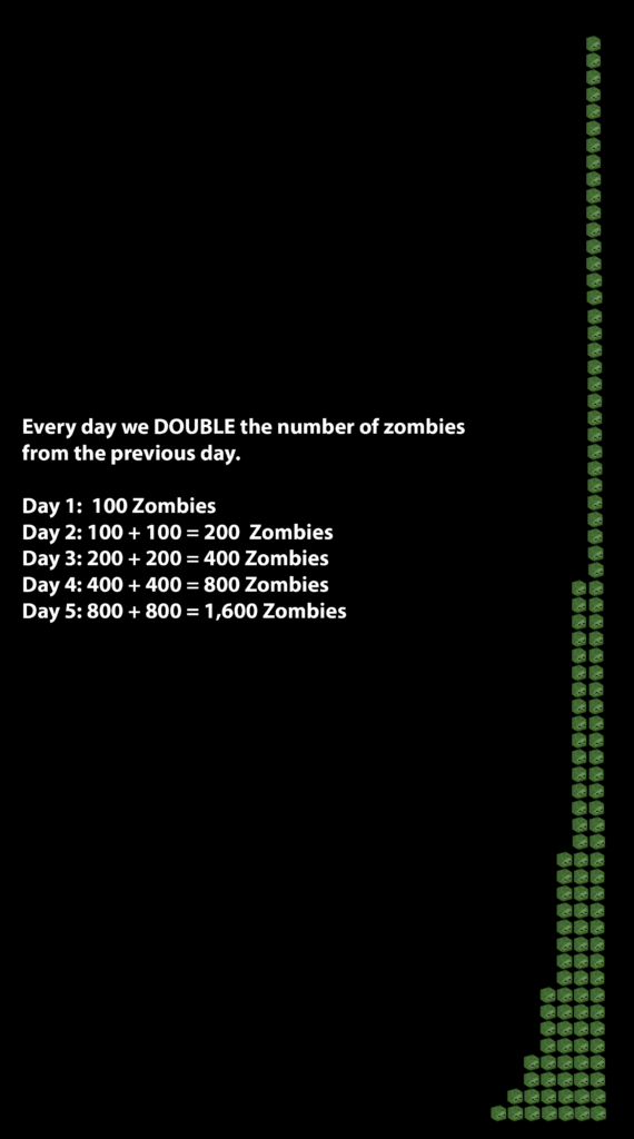
Every day, we have double the amount of people that can make you “it”. From playing Infection, we know that those games get over faster, and this is why. By Day 4, our 500 players and MORE are tagged. But a day sooner? That doesn’t seem so bad. But let’s look and see if we keep this rate up for a couple more days.
If we double every day, this is called “Exponential growth” it doesn’t seem so bad, until it is bad. Then it is really, really bad.
Let’s go straight to math.
If we compare this in a math chart, Bot/Player vs Infection:
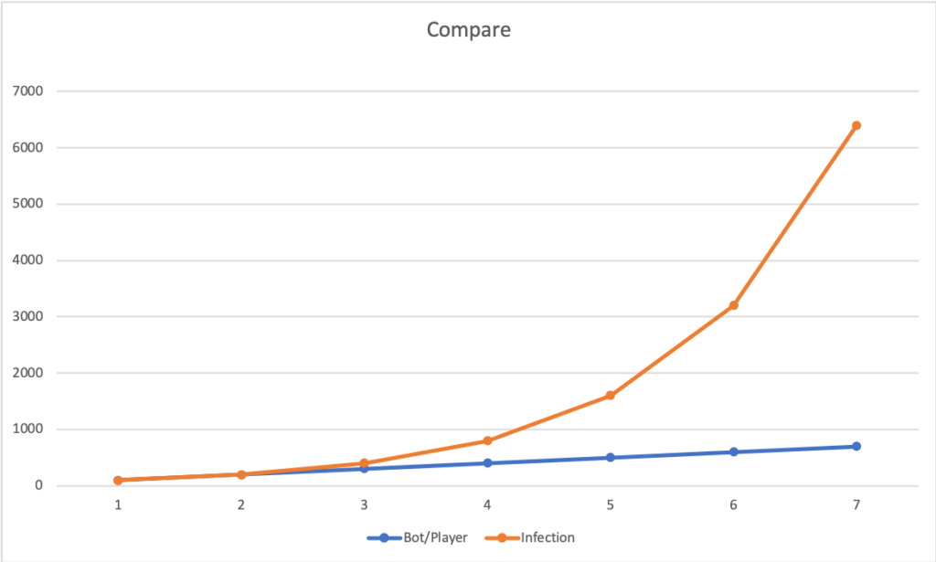
Yes, I show my kids charts. But let’s talk about how to interpret this chart. This is saying, that from left to right (also called the X-Axis) is the number of days that have passed. From bottom to top (also called the Y-Axis) it is saying the number of players that have been “it” on a given day. So if you look at day 5 on the X-Axis, and scan upward, you see that the blue line (noted as the Bot/Player mode) would have less than 1,000 people having been “it”. But if you continue looking higher, you see the Red line (notes as Infection mode) is just shy of 2,000 people who have been “it”. So it shows how these two things grow differently over time.
The numbers that can be found on Johns Hopkins COVID-19 tracker (I find this information scary, but here is the link https://coronavirus.jhu.edu/map.html)
We can see that we are playing Infection.
Looking at the actual facts, the United States cases are doubling every 2.5 days (or so).
As of 10 am on April 11th, 2020, the United States has 501,680 confirmed cases.
Our Country has roughly 330 million in it. (https://www.worldometers.info/world-population/us-population/)
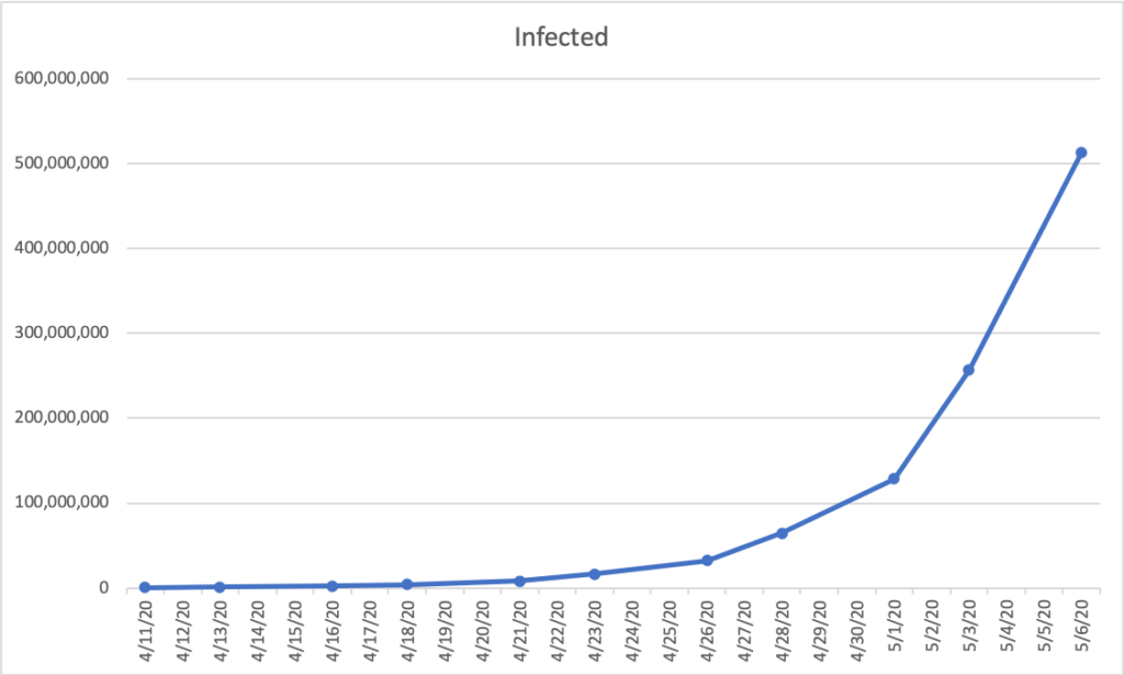
So that means, that if we do nothing, our entire country will be infected by early May.
This is very scary to me. This is SO real.
But let’s break this graph down. This graph shows the number of confirmed cases over time. We have factual data showing that we are starting today with about 500,000 cases, and every 2.5 days it doubles. So you see from left to right (X-Axis), the dates are listed as 4/11, 4/13, 4/16. This is because 11 + 2.5 is 13.5. And then 13.5 + 2.5 is 16. (The 13 just doesn’t show the extra .5) From bottom to top (Y-Axis), it is showing the number of confirmed cases in increments of 100 million. So this graph shows that with our current data, if we change nothing, the number of confirmed cases will match the entire US population by May 6, 2020.
So, we need to take this VERY seriously. But there is two things that are even more scary to me.
- Not everyone sick looks like a Zombie. Many people who spread the Coronavirus feel no symptoms. They don’t know they are sick. So they are spreading the virus, and think they are fine.
- 1 in 10 people who get sick, have to be hospitalized for this sickness. As we have no treatment for it, our hospitals have to simply do everything they can to keep patients comfortable.
Why is #2 scary? It is scary because there are roughly 400,000 hospital beds in our country. I am going to show you the chart from above, but divide numbers by 10, so you can see the number of confirmed cases that will need to be hospitalized.
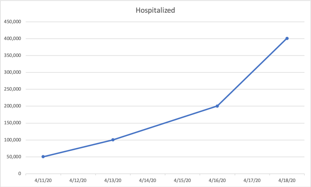
How to interpret this chart: from left to right (X-Axis) we have the days from today, forward. From bottom to top (Y-Axis) we have the number of hospital beds that are full of a person with a confirmed case, broken down by 50,000 increments. So the blue line shows that every 2.5 days, that number doubles. So on 4/11, you see we start at roughly 50,000 beds full. On 4/13, you see that has tipped just over 100,000.
If we could easily get people who need a hospital bed, to a hospital bed, we would run out of hospital beds by April 18th, 2020. At that point, Doctors have to start choosing who they can to save.
How can we take power back?
First of all, the professionals are literally doing everything they can to solve this, so here is what WE can do, and what we MUST do.
You have heard these suggestions before, so I want you to understand how they actually help.
We have 3 kinds of people in relation to this virus.
A) People who could get sick
B) People who are sick
C) People who are no longer sick.
And what turn people who are could get sick, into people who ARE sick? Contact.
So, if we shaped it like a Math Problem:
If “People who could get sick” time “Contact with People who are Sick” is Greater than “People who are no longer sick” than our infection goes up. So it is Contact/Recovered must be < 1. So reducing Contact with Infected people is the ONLY way to help this problem. How do we reduce contact?
- Wash your hands frequently. Wash your hands like you were just cutting up Hot Peppers for Salsa and you need to go put in your contacts.
- Don’t touch your face. This infection can be air born, but you can also pick it up from touch things (Doorknobs, shopping carts) and it can get in your body from your eyes, nose, and mouth.
- Stay Home. By not going near people, you cannot possibly spread the disease.
These simple steps can slow down the spread. If we can slow it enough that the time it takes to double goes from 2.5 days to even 3 days, look how much it helps our problem.
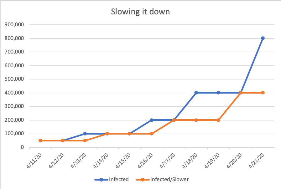
Interpreting this chart: From left to right (X-Axis) we have the days, 1 by 1, from 4/11 – 4/21. From bottom to top (Y-Axis) we have the number of confirmed cases. The blue line shows us what it looks like when the infected follow their current 2.5 days to double. The orange line shows us what it looks like if we slow that down to every 3 days.
Follow the three steps above, could save MANY LIVES. Please take the power you can take, and follow the steps.